2024
Elevating Women's Day 2024
Brand
27four Investment Managers
Deliverable
Event Stationery
Scope
Event design + Print production

01 — Brief
A Room Full of Guests
As a financial services group, 27four places diversity, equity, and inclusion at the core of their mission. Women's Day is significant in their community, a moment to celebrate the people their work is actually for. For their 2024 Women's Day brunch, the brief was simple: a menu and name tag for each of the 125 guests. The stationery ran alongside their "Who we do it for" campaign, so it had to feel personal and considered, not just functional.
My task: design and execute a cohesive paper stationery system that felt celebratory for a corporate event, produced in-office and using a Cricut Maker 3 paper-cutting machine.
02 — Strategy
The Brand


High-contrast, structured brand identity.
The Venue

Elegant, luxurious heritage venue.
The strategy was to soften the brand's tone to make guests feel seen. While 27four's visual language provides structure, a purely corporate approach risked feeling disconnected from the celebratory spirit of Women's Day. Throughout, the tone was intentionally centred on the individual guest. The brand's foundation remained, but a more distinctive typographic and visual system helped bridge the gap between 27four's identity and the event's more personal, festive spirit.
Working through the brief also uncovered a gap in the arrival experience: checking when guests would first receive anything with the brand on it showed that nothing reached them until they sat down, so a third piece was added to cover that moment. Menus and name tags only reach guests once they sit down. To cover that gap, a third piece was proposed: a circular tag for every champagne glass. It attached to something guests were already holding, rather than adding a separate item to manage and became part of the decor.
03 — Process
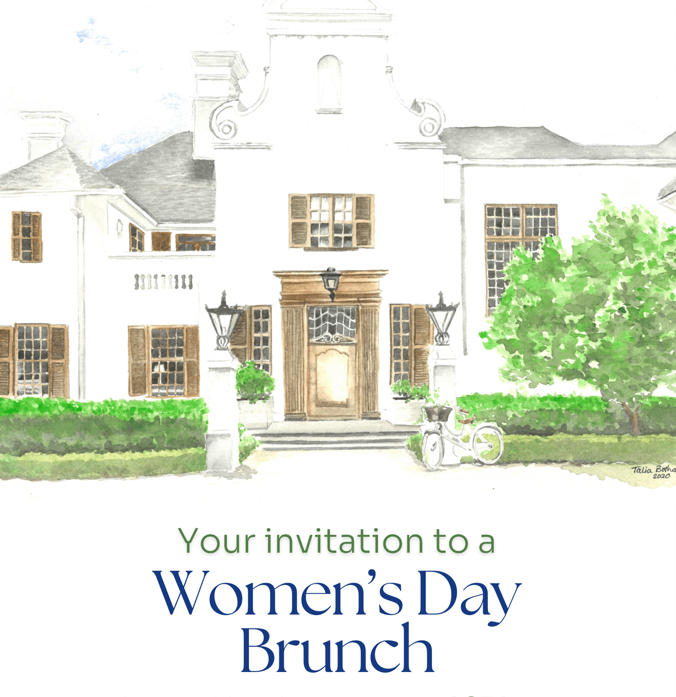
The invitation set the visual direction and brief for the stationery. (Not my design.)

Lemon trees outside the venue.
04 — Design Decisions
Three Objects, One Story
With the concept in place, the system had to work across three formats at very different scales: an A5 menu card, a name tag, and a circular glass tag.

All three pieces at a single place setting — the menu card centred on the plate, name tag with citrus sprig to the left, circular glass tag on the flute stem.
Typography: The Seasons, an elegant serif typeface carried over from the digital invitation, was used for guest names and headings. It softened the brand's corporate edge from the moment guests picked up the first piece. Sora handled body text, keeping the brand present without dominating.
Colour: The palette came directly from the decor brief — pale blue, lemon yellow and Mediterranean greens — mapped against 27four's brand palette to keep the stationery consistent with the room and the brand.
Die-cutting: The citrus illustrations were die-cut to extend beyond the card edges, reinforcing 27four's high-contrast identity and giving each piece a dynamic, bespoke quality.
Sequence: Each of the three pieces was intentionally sequenced to shape the guest experience at every stage: the glass tag welcomed guests and introduced the campaign message upon arrival, the menu card set the tone at the table, and the name tag personalised each place setting, ensuring a thoughtful progression from entry to seating.
05 — Production & Outcome
To Elevate a Morning into a Celebration
All 375 pieces were produced entirely in-office over three weeks on a Cricut Maker 3. Adobe InDesign's Data Merge and a CSV file automated the 125 unique name tag layouts. The labour-intensive part was peeling 375 cut pieces off the Cricut mats by hand.
The event brought together a diverse group of women from across the firm's network. The stationery gave guests a consistent thread to follow throughout the morning, making the experience feel intentional. A simple menu and name tag developed into a unified system that gave the morning a consistent, personal feel; some guests connected so much they took their lanyards home.
The stationery landed well, with the firm and guests both responding positively. The firm’s CEO commented that it was one of the best events they'd ever done, while many guests shared compliments on the unique lemon motif and diecut details. Several attendees mentioned that the personalised name tags and thoughtful touches made them feel genuinely welcome and valued.

Name tag, menu card, glass tag — the full system in place.

